Getbrand developed a new corporate identity for the company "Agroeco"

Photo is illustrative in nature. From open sources.


On the one hand, the corporate style had to be concise and business-like. On the other hand, it had to be projected onto Agroeco products, which would be on the shelves in supermarkets and compete with other brands known and familiar to the buyer. The designers wanted to develop a one-stop solution that would help the company present itself as a successful, trusted and industry leader to partners, employees and suppliers. All this needed to be reflected in brand communication.
The previously developed logo consisted of an inscription and an image of leaves folding into a shamrock, and was completely unsuitable for use on MEAT products packaging. The designers proposed a new logo in the form of a large green letter "A", which is based on a leaf, as a symbol of the naturalness of products. Such a letter is easy to see and remember, thanks to it, an association with the company itself and its products is easily formed.
The agency created an identity for various points of contact, patterns and corporate colors - bright green, brown, white and dark green. These colors are associated with the agro-industrial sector and the people who work in it.
Read together with it:
- Getbrand has developed a new packaging design for Casa Margot sausagesThe work began with a patented audit, “Three Layers of Efficiency.” Using the proprietary tool, the agency’s specialists evaluate the packaging design on three layers: visual, contextual, and conversion. Based on the audit results, the experts rated the visual communication efficiency of the old brand design at only 34%. The development of the updated design and logo was done as part of the “EXPRE...
- Getbrand has developed a new packaging design for "Agroeco"Agroeco is a full-cycle agro-industrial holding. The structure of the holding includes a crop cluster, pig breeding complexes, feed mills and the most modern MEAT processing plant in the country. First of all, an audit was conducted according to the “Three Layers of Efficiency” methodology, which helped to identify weaknesses in the current design: the invisibility of the logo, the ne....
- Getbrand has developed a new package design for "Jelene" sausagesThe design should be understandable for the consumer, inspire confidence, positive emotions from the anticipation of the joy of loved ones after a delicious breakfast / lunch / dinner and receiving gratitude for it. It is also necessary to broadcast the reliability, freshness and safety of products. In addition, despite the goal to update the packaging, it is important not to forget about existin....
Test for Atnibiotics in Milk
 PIONEER MEIZHENG BIO-TECH (5 in1) JC0586 - Antibiotic tests 5 in 1 / Rapid tests for determining the residual amount of β-lactams, tetracyclines and cephalexin in milk, whey
 Rapid 4 in 1 tests for determining the residual amount of neomycin, kanamycin, gentamicin, spectinomycin in milk, whey
 Express tests for determining the residual amount of β-lactams and tetracyclines in milk, whey
 PIONEER MEIZHENG BIO-TECH (5 in1) JC0871/ Rapid tests for the determination of the residual amount of β-lactams, tetracyclines, chloramphenicol, streptomycins, ceftiofur in milk, whey.
 PIONEER MEIZHENG BIO-TECH (5 in 1) JC0726 / Rapid tests for determining the residual amount of Bacitracin, ansamycins, clindamycin, spiramycin, florfenicol in milk, whey
 Rapid tests for fluoroquinolone, erythromycin, lincomycin, tillosin and tilmycosin residues in milk, whey
- Express tests for determining the residual amount of β-lactams, tetracyclines, chloramphenicol, streptomycins in milk, whey
- ANTIBIOTICS / ELISA TESTS
- TEST KIT for determination of inhibitory agents PIONEERPRODUKT® DASH-TEST, WC0040
- Rapid tests for determining the residual amount of tetracyclines in meat
Laboratory equipment
 Drying cabinets SHS (SKTB, Smolensk)
 Abbe refractometers Atago
 Indicator strips "NS-Chlorine", 25 pcs.
 Stationary thermohygrometer Testo 608-H2
 Laboratory thermostat-reducer "LTR-24"
 MICROFAST® underlays
- KL series flask heaters
- LOIP LH-1xx Fixed volume flask heater (up to +400 °C)
- Laboratory low table (750 mm) BA-SL-X.XX SLn TR
- Magnetic stirrer С-MAG HS7
- Light colored glass bottle without a faucet
- HI 83141 Portable pH meter/millivolt meter/thermometer (pH/mV/T) (0...14.00 pH)
- Mobile table BA-CL- X.X PS TR
- Low wall table BA-CL-X.X SPn TR
- Sets of weights
Packing
 Ice cream chopsticks
 Paper for micro-ribbed
 KH PACK® bag making paper
 Grease and barrier paper KH PACK®
 The paper packing fastened anticorrosive UNIK 14-70 THAT 5453-003-05773103-2005
 Salad dressings
- Backed Foil
- Paper sacks
- Laminating paper KH PACK®
- Skiving and Hemming Technology
- Korreks for desserts
- Laminating paper KH PACK®
- Cartons for milk and dairy products
- Cover
- Plastic packaging for cakes and pastries
Additional Products
 Ice cream sticks Standard 114
 Petri dish 90 mm
 Ice cream sticks Magnum (curly)
 Ice cream sticks (round)
 Auxiliaries for sugar products
 J-Bottom technology
- Ice cream sticks Standard 93
- Wafer cup and cone
- Pepsin whey pork
- Ice cream sticks (with logo)
- General purpose environment of SPC "Biocompass-S" (Uglich)
Consumables
 Milk filters - primary cleaning
 Milk bottle
 Reusable plastic syringe
 Forged pitchforks
 Anti-catfish milking rings
 Drencher for feeding calves with a flexible probe
- Non-returnable cup for udder treatment
- Pump for artificial ventilation of the lungs
- Acid detergent (20l / 24kg)
- Plastic bracelet
- Gas tailing cutter
- Apron and armlets
- Latex gloves (long cuff with roller), (color blue, pack of 50 pieces)
- Self-adhesive hoof bandage
- Foam cup for udder treatment
Microbiology
 Substrate for accelerated determination of QMAFAnM, (catalog number LR1321)
 MicroFast® Staphyloccocus aureus Confirmation Plate Staph.aureus Confirmation Plate (cat. no. LR1005Q)
 Substrate for determining QMAFAnM (catalog number LR1001)
 Coliform Count Plate (catalog number LR1002) MicroFast® Coliform Count Plate
 MicroFast® Salmonella Count Plate (SAL), for the determination of Salmonella in food and environmental samples (Catalog #LR1006)
 MicroFast® Lactic Acid Bacteria Count Plate (Part Number LR1312)
- MicroFast® Bacillus cereus Count Plate (catalog number LR1010)
- MicroFast® Enterobacteriaceae Count Plate (cat. no. LR1011)
- MicroFast® Coliform & E.coli Count Plate
- Yeast & Mold Count Plate (cat. no. LR1003) MicroFast® Yeast & Mold Count Plate
- MicroFast® Environmental Listeria Count Plate
- Substrate for determining the number of staphylococci (Catalog number LR1005) MicroFast® Staphyloccocus aureus Count Plate
- MicroFast® Microbiological Substrates
Our News
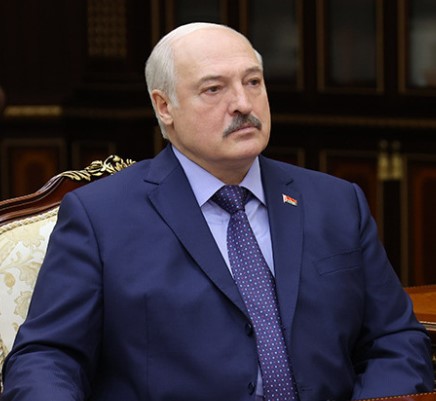 Лукашенко высказался против простых решений по Витебской области и действий по пути наименьшего сопротивления 25.10.2025
 Производство молока, инвестиции. Какие точки роста на пятилетку видит руководство Витебской области25.10.2025
 Первичная задача - дойти до каждого сельхозпредприятия. Депутат о развитии АПК Витебской области25.10.2025
- Совместные проекты и обмен опытом. В каких направлениях Беларусь и Казахстан готовы развивать сотрудничество в АПК 24.10.2025
- Беларусь и Алтайский край намерены увеличить биржевую торговлю сельхозпродукцией24.10.2025
- Минск и Алжир готовят переговоры на высшем уровне. Почему Беларусь нацелилась на Север Африки?24.10.2025
- "Ambitious plans." Brest Regional Executive Committee on the region's contribution to food security in the Union State. 23.10.2025
- Decree: Regional executive committees are granted the right to form agricultural raw material zones23.10.2025
- New support measure for the agricultural sector. The Ministry of Agriculture and Food explained the legislative changes.23.10.2025
- Recognition of merit and dedication. State awards were presented in Minsk to representatives of various fields.23.10.2025
- The Belarusian delegation held talks in Kampala with colleagues from Uganda, Iran, and India.17.10.2025
- Azerbaijan entered the top three largest buyers of forest products at the Belarusian Commodity Exchange (BUCE).17.10.2025
- New Products and Volume Growth. The Ministry of Agriculture and Food on the Dairy Industry Development Strategy through 2035.17.10.2025
- Ministry of Agriculture and Food: Belarus is growing its milk production16.10.2025
- Ambassador: Belarusian food exports to Kazakhstan have increased significantly16.10.2025
- Belarusian goods account for 94% of Russian dairy imports.16.10.2025
Articles
 Сокращение супермаркетов и гипермаркетов в России продолжается: эксперты говорят о новой волне ритейла25.10.2025
 Парагвай: Экспорт субпродуктов является растущей отраслью и уже достиг 95,4 млн долларов США25.10.2025
 Китай увеличил производство свинины на 7% в третьем квартале года25.10.2025
- Новые горизонты сотрудничества: Россия и Аргентина обсуждают совместный доступ на рынки продукции животного происхождения25.10.2025
- Птицефабрика «Третьяковская» в Воронежской области удвоит производство яиц на 2 миллиарда рублей25.10.2025
- Indilight held a culinary masterclass with Silvena Rowe, promoting turkey as a healthy food.25.10.2025
- Министерство сельского хозяйства США представило план по снижению цен на говядину25.10.2025
- С января по июль экспорт свинины из ЕС вырос на 1,6%25.10.2025
- Рост цен на мясо в Самаре: говядина достигла 750 рублей за килограмм25.10.2025
- Московская область планирует нарастить мясное производство на 25% к 2030 году25.10.2025
- Производство мяса птицы в Омской области выросло на 75% за 9 месяцев 2025 года25.10.2025
- Цены на мясные продукты в России продолжают расти: анализ причин и прогнозы25.10.2025
- Product quality violations were discovered at the Pravilnye Produkty plant.23.10.2025
- Nalchik Meat Processing Plant Puts Its Accounts Receivable Up for Auction23.10.2025
- Modernization of poultry farming in the Nizhny Novgorod region: new opportunities and production growth23.10.2025
- Increasing egg production of laying hens in Kabardino-Balkaria: successes and prospects23.10.2025
Economics
 10 reasons to take a deposit04.05.2025
 NYT увидела в санкциях Трампа новый уровень экономической войны США25.10.2025
 В Кремле пообещали ответ на санкции сообразно интересам России25.10.2025
- Zakharova promised "tough steps" in response to the 19th EU sanctions package.25.10.2025
- США ввели санкции против президента Колумбии25.10.2025
- Чего ожидать от «одной из самых рискованных» поездок Трампа25.10.2025
- Callas spoke about the EU's joy over new US sanctions against Russia.24.10.2025
- Постпредство России назвало санкции ЕС «сизифовым трудом»24.10.2025
- Путин оценил новые санкции США24.10.2025
- Путин вспомнил, когда Трамп ввел наибольшее число санкций против России24.10.2025
- Белый дом заявил о надежде на то, что новые санкции нанесут вред России24.10.2025
- The EU imposed sanctions against Medvedev's aide and the HSE rector.23.10.2025
- Politico learned of a split in the EU over a new €140 billion loan to Ukraine.23.10.2025
- The European Union has banned the import of motorized toys into Russia.23.10.2025
- The Russian Union of Travel Industry (RUTI) clarified that EU sanctions will not affect Russian tourism.23.10.2025
- AvtoVAZ and Polyus were included in the 19th package of EU sanctions against Russia.23.10.2025
Antibiotics in Milk
 В Британии предупредили о риске для миллионов из-за супербактерий06.01.2025
 Moscow court sides with Indian company in dispute with Health Ministry26.11.2024
 Scientists estimate increase in mortality due to drug-resistant bacteria29.10.2024
- Antibiotics for livestock and pesticides found in poisoned family's home29.10.2024
- Izvestia reported on the shortage of widely used antibiotics in Russia29.10.2024
- The Ministry of Health called data on the shortage of antibiotics unreliable29.10.2024
- Scientists warn of threat of return to pre-penicillin times29.10.2024
- The Ministry of Health explained how attitudes towards antibiotics changed during the pandemic07.05.2024
- WHO explains the risks of taking antibiotics "just in case"06.05.2024
- Doctors warn of bad practices after government decision on antibiotics25.04.2024
- The Ministry of Health removed antibiotics and hormones from the standard treatment of ARVI25.04.2024
- Antibiotics in oil: myth or reality?06.03.2024
- Antibiotics in sour cream: myth or reality?05.03.2024
- Antibiotics in goat milk: effects, problems and control measures16.02.2024
- The Japanese will stop producing the popular antibiotic vilprafen in Russia23.12.2023
- Antibiotics in Milk21.12.2023
Antibiotics in Meat
 Antibiotics in pollock25.02.2024
 Antibiotics in herring: myth or reality?12.02.2024
 Antibiotics in perch10.02.2024
- Antibiotics in sprat: facts and myths10.02.2024
- Antibiotics in tuna: an important health and environmental issue09.02.2024
- Antibiotics in meat30.01.2024
- Antibiotics in chebureks: myth or reality?29.01.2024
- Antibiotics in cutlets: problem or myth?18.01.2024
- Antibiotics in Chicken: Where Are the Highest Concentrations?17.01.2024
- Antibiotics in carp17.01.2024
- Where Are More Antibiotics in Chicken: Reality and Cautions16.01.2024
- Antibiotics in Salmon: Safety and Product Quality16.01.2024
- Antibiotics in Turkey15.01.2024
- Antibiotics in Sal: Reality and Safety Issues15.01.2024
- Antibiotics in Fried Dumplings: Facts, Risks and How to Stay Safe15.01.2024
- Antibiotics in sausages14.01.2024
10 Interesting Facts
 Antibiotics in Coffee: Myths and Reality03.05.2025
 Forged forks: 10 interesting facts16.05.2024
 Swimming pool and weight loss: 10 interesting facts10.03.2024
- Tests for antibiotics in milk - 10 interesting facts07.03.2024
- Cleaning the kettle from scale, 10 interesting facts...06.03.2024
- Antibiotics in beer: 10 interesting facts04.03.2024
- Wild boar, how to survive...01.03.2024
- Purulent mastitis, 10 interesting facts27.02.2024
- Lemon and alcohol: 10 interesting facts25.02.2024
- Mint - 10 interesting facts25.02.2024
- Wild boar, 10 interesting facts20.02.2024
- Wild boar and domestic pig: comparison and advantages20.02.2024
- Cottage cheese, 10 interesting facts20.02.2024
- 10 Interesting Facts About Milk19.02.2024
- How to Clean a Toilet - 10 Interesting Facts (Acid vs Alkaline)18.02.2024
- Goat's milk: 10 interesting facts16.02.2024
Diseases of cattle
 Dicroceliosis in cattle09.03.2024
 Demodicosis in cattle01.03.2024
 Purulent mastitis of cattle27.02.2024
- Hypodermatosis in cattle20.02.2024
- Hemonchoz in cattle11.02.2024
- Bursitis in cattle30.01.2024
- Brucellosis in cattle29.01.2024
- Bronchopneumonia in calves27.01.2024
- Bronchitis in cattle26.01.2024
- Mortellaro disease in cattle24.01.2024
- White muscle disease in cattle23.01.2024
- Babesiosis in cattle22.01.2024
- Cattle acidosis20.01.2024
- Arthritis in cattle20.01.2024
- Anaplasmosis in cattle18.01.2024
Misc
 Antibiotics for coughs: when they are needed and when they are not11.02.2024
 В Минтруда напомнили об основных мерах безопасности во время проведения республиканского субботника 25.10.2025
 In Minsk, an unlicensed BMW driver lost control and crashed into a pole.25.10.2025
- В Вилейском районе правоохранители застали самогонщиков с поличным: выявлено 11 тыс. литров браги25.10.2025
- He took her pension and fed her once every two or three days. In Vitebsk, a son drove his disabled mother to exhaustion.25.10.2025
- В Беларуси с начала года в авариях пострадали 340 детей24.10.2025
- МВД: реальные истории осужденных сверстников - эффективная профилактика преступлений подростков 24.10.2025
- Минчанин осужден за истязание беременной сожительницы24.10.2025
- A drunk Pinsk resident stole a car and damaged parked vehicles.23.10.2025
- The Ministry of Emergency Situations will hold the "For Safety Together" campaign in Belarus from October 25 to November 2.23.10.2025
- This swimming season, 44 fishermen have drowned in Belarus, 25 of whom were drunk. 23.10.2025
- A drunk teenager stole a car in Bobruisk. 23.10.2025
- "A House Without Fire": Rescuers Inspect Homes in the Gorki District 23.10.2025
- She'll still be in your dreams! A Belarusian woman visited Karelia, and here's what she had to say.18.10.2025
- They "worked" for less than a month. A young drug couple from Mozyr was taken into custody.18.10.2025
- Ten ppm: A man died of acute alcohol poisoning in Volkovysk.18.10.2025
Cloud of Tags
В китаеПольшаВладимир ПутинДетиСвининаОтпускНедвижимостьПрокуратураДолларКредитДжо БайденMicrosoftСырыЗдоровьеУченыеЗаконАлександр ЛукашенкоРоссельхознадзорПодмосковьеВакцинацияКрупный рогатый скотЦеныБразилияСанкцииAppleМясоЖивотноеИнфляцияЗависимостьЯйцаДиректорПроизводство молокаАлкогольДмитрий песковЭкспортМужчиныКартофельГерманияПраздникКазахстанTelegramМинфинВластиФруктыМаслоСельское хозяйствоИнвестицииКоронавирусBloombergФранцияУкраинеОбщепитМоскваМолокоНефтьОнлайнРаботаДональд Трамп2024Мясо птицыКризисСанкт-ПетербургРосстатАнтибиотиковЕСКлиматВыручкаРоссиянеСудПтицефабрикаПравительствоГазпромИталияЗаконопроектПродукты питанияКарантинЗеленскийЗапретТатарстанСШАПесковПоддержкаВакцинацииУборкаЕврокомиссияКитайЭкономикаРубльАзербайджанПензенской областиТАССПродовольствиеАлкогольного опьяненияСмертьНовостиДоходыСубсидииМясокомбинатКанадаТурцияЛекарстваИммунитетГовядинуFacebookОрганизмИмпортУкраинаКрупного рогатого скотаКофеБолезньПитаниеЕгипетGoogleАвстралияФермерБизнесГовядинаВьетнамRussiaИсследованияВирусКолбасыЕАЭССпутник vКРСЯпонияАЧСПроизводство мясаУзбекистанБройлерCOVID-19БеларусьМинскМинздравReutersЦентробанкРоспотребнадзорВостокЛечениеВеликобританииУрожаяМЧСДеньгиМинсельхозминистр сельского хозяйстваРодителиВеликобританияТребованияПродукцияРоссия